
Christian Carter “Escape The Flat” @ Longstaff Memorial Gallery
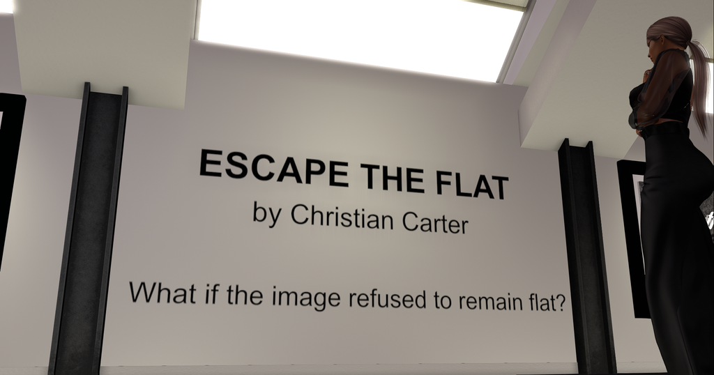
The Concept: What if the image refused to remain flat?
This exhibition combines photography with three-dimensional elements. Frames open into physical space, images unfold beyond their edges, and familiar photographs transform into objects that occupy the gallery rather than simply hanging on its walls.
The works explore fragmentation, confinement, memory, and the desire to break free from imposed limits. Some images fracture into floating pieces, others extend beyond their frames, while portals, shadows, and sculptural elements blur the distinction between photograph, object, and environment.
Rather than presenting photography as a finished, static image, Escape the Flat invites viewers to experience it as something that can expand, transform, and escape its own dimensions.
The show runs through July and August. When you’re ready, teleport to the gallery: https://maps.secondlife.com/secondlife/Rainier%20Summit/137/226/3061
One of the highlights of my SL is visiting a show by Chris! Not only because we have worked together for a few years now but because this man has so many things he is not afraid to explore through his art. This show takes a new direction and is the honing of Chris’ “mixed media” in a digital world!
As a creator who works in 3D, this moved me in more ways than usual, with my favourite reaction, “how the hell did he do that?” happening at every corner! Seems he has a few things he can teach me, hehe. ♥
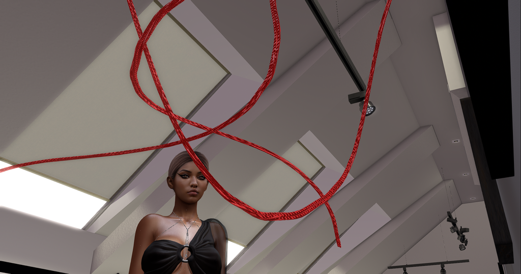
And where I usually love making tourist photos, especially when every corner was a wow moment, I’m not adding more spoilers than this!
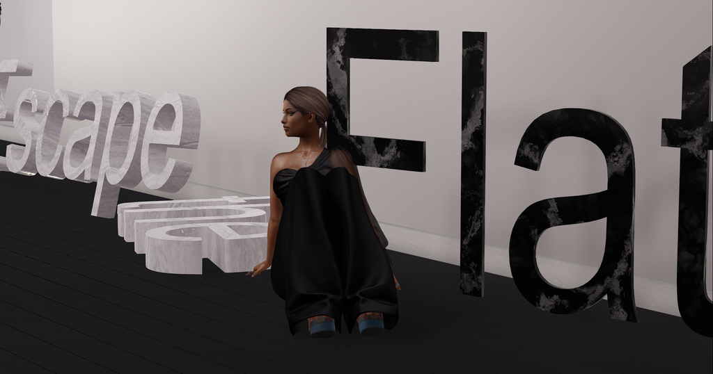
I’m so proud to be able to watch Chris’ evolution and breakthroughs as an artist! Every show is more mind-blowing than the last and I can’t wait to see where all this is going to take him next!
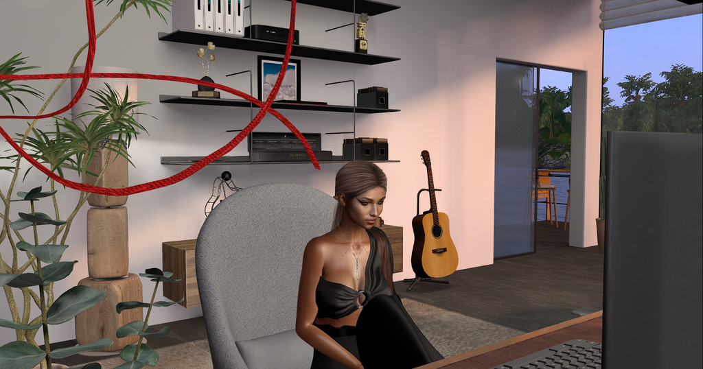
Congrats on another epic show Chris! Thank you for the years of inspiration. ♥